Poshmark Redesign
A UX case study on improving the buying experience in Poshmark's mobile app

Overview
Poshmark is a large social marketplace to buy and sell clothes, accessories, and more from users' virtual closets. Since most of the items sold are secondhand, it's viewed as being a more eco-friendly option for shoppers. Being a Poshmark user myself, I have some minor complaints about the UI, but have come to find that many of my peers stopped using it or are hesitant to start, especially when it comes to buying.
Objective
As a UX design student, I wanted to challenge myself to find these user pain points that answer the question:
"What is hurting the buying experience for Poshmark users?"
My aim is to streamline the buying experience while updating the UI of the Poshmark mobile app over the course of 10 weeks.
Start Date: February 20, 2022
Finish Date: May 2, 2022
Research
During the first two weeks I conducted user research by reading reviews in app stores, discussions on Reddit, finding user statistics, and conducting user interviews. I interviewed 5 individuals who fit in Poshmark's key demographics and are familiar with the app or with other buy-sell apps. During the interviews, I asked users to open the app either on my phone or theirs and tell me their thoughts and feelings while "shopping". I also gathered insights on other similar apps they may use to conduct competitor analysis.
Poshmark's Existing Interface as of 2022
Feed

Shop

Listing Details

Account

Closet

I noted down my interviewees' pain points and organized them with an affinity diagram based on three broader issues, and then defined solutions for these issues that I could take on.

I later brainstormed ideas on how I could implement these solutions and organized them based on which would be most critical and most feasible within the allotted time.

Design
Weeks 3-6 consisted of planning out the redesign with a site map, user flow, and wire framing. My objective was to keep only the necessary features while adding new ones that would help the user's end goal. Figuring out the navigation was crucial at this point so I went through various tests and iterations before implementing style.
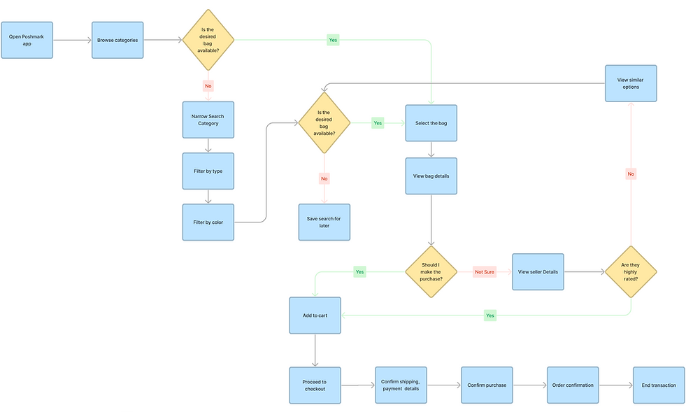
Site Map

User Flow
I wanted my Users to feel confidence when purchasing from a certain seller by creating a customer reviews section in their profile. I also wanted to increase the likelihood of my user finding what they want by showing them similar items to what they are looking at or have the option to "save search" to later find new items of that criteria.
Sketches and Wireframe


Style Guide

Final Mockups
During the last 3 weeks I created high-fidelity mockups, conducted user testing, and reiterated my designs based on feedback. I chose to keep design elements visually simple while giving more room for the images to shine. I also wanted to give it a more modern and vibrant feel in order to attract a younger audience with a bold font and brighter color.

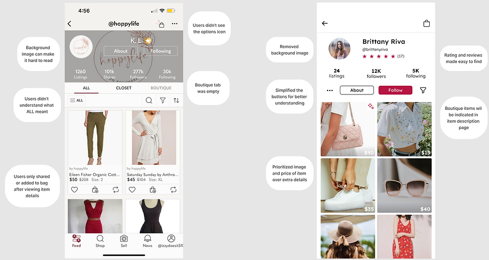
Original Profile Page
Redesigned Profile Page
Original Home Page
Redesigned Home Page

Original Shop Page
Redesigned Home/Likes & Shop Page

Demo
Play the video to see my project in action, or check it out on Figma.
Reflection
This case study was an opportunity for me to apply the principles of user-centered design that I learned in my UX/UI Design course, focusing on creating an experience tailored to the needs and preferences of the users. This experience emphasized the significance of research and user feedback. Early user testing played a crucial role in refining the design, as it provided valuable insights and allowed for adjustments based on direct user feedback. This iterative process not only enhanced the user experience but also underscored the importance of involving users throughout the design journey.
Throughout the project, I gained proficiency in using Figma through hands-on experience and online resources. Figma became an integral tool in visualizing and iterating on my design concepts. As I move forward, I plan to continue utilizing Figma in future projects. Additionally, I aim to further develop my UX/UI skills, with a focus on enhancing my prototyping abilities, honing my information architecture skills, and mastering user testing methodologies. These skills will contribute to my growth as a designer, ensuring that I can create user-centric and visually compelling experiences in my future endeavors.
I appreciate your time in reviewing my project! I acknowledge that there's plenty for me to learn, and I'm open to any feedback you might provide.